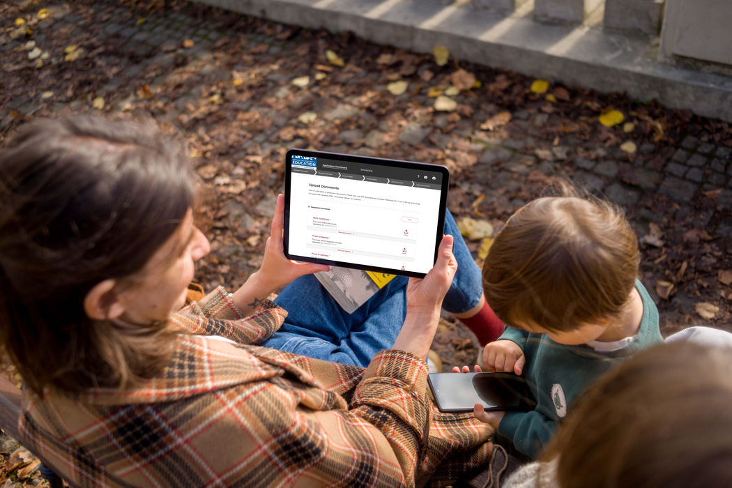
Maryland — Child Care Scholarship Program
Simplifying access to early childhood financial support through thoughtful, user-centered design.

Overview
The Maryland Child Care Scholarship Program is a public benefits platform that helps families access financial support for early childhood care. As the lead designer, I guided the end-to-end UX and UI redesign, transforming a complex, outdated application process into an intuitive, accessible digital experience. Working closely with state stakeholders and content strategists, the new platform empowers families with clear guidance, responsive design, and improved transparency—making it easier to apply for assistance and track their progress with confidence.

Strategic Design Goals
Translating complex program requirements into clear, accessible digital journeys.
1. Break down complex eligibility requirements and form logic into a clear, step-by-step process that’s easy to follow.
2. Design for a wide range of literacy, device, and ability levels—ensuring compliance with WCAG AA standards.
3. Provide clear progress indicators, application status updates, and contextual help to reduce anxiety and confusion.
4. Ensure the platform works well for users with limited digital access, including mobile-first design and plain language content.
5. Create scalable components and workflows that support future improvements and reduce support requests.
My Role
I led the redesign of the Maryland Child Care Scholarship platform as the sole product designer, owning the experience from early research to final handoff. My responsibilities included:
• Conducting stakeholder interviews and user journey mapping
• Defining UX strategy and prioritizing accessibility for underserved users
• Designing responsive wireframes and UI components
• Collaborated with content strategists to ensure policy compliance
• Worked with developers to deliver accessible, accurate implementation
.jpeg)
Process: Designing for Equitable Access
Creating a user-centered experience that simplifies early childhood financial support for families in need.
1. Discovery & User Research
Conducted interviews with families, caseworkers, and program administrators to understand barriers and frustrations in the existing application process. Mapped user journeys to identify pain points and moments of confusion.
2. Stakeholder Collaboration
Engaged closely with state policy experts, content strategists, and technical teams to align design goals with legal requirements and operational constraints. Ensured the platform supports compliance without sacrificing usability.
3. Information Architecture & Flow Design
Simplified complex eligibility rules into a clear, step-by-step application flow. Created wireframes that break down forms into manageable sections to reduce cognitive load and improve completion rates.
4. Visual & Interaction Design
Developed accessible UI components and responsive layouts that meet WCAG AA standards. Focused on clear feedback, error prevention, and mobile-first design to serve diverse user needs.
5. Testing & Iteration
Conducted usability tests with real users and stakeholders to validate clarity, accessibility, and emotional impact. Iterated designs based on feedback to refine navigation, content, and overall experience.

Key Features
Built-in solutions that enhance clarity, accessibility, and trust
—to empower families and streamline the application process.
Step-by-step application flow
Guides families through each stage with clear prompts and simplified forms— boosting successful completions.
Responsive, mobile-first design
Delivers a seamless experience across devices, enabling families to apply anytime, anywhere without barriers.
%201%20(1).png)
Real-time status tracking
Keeps users informed with live updates on their application progress, increasing transparency and reducing uncertainty.
Integrated help and support
Offers assistance and alerts throughout the process, empowering users to overcome challenges without frustration.
Refining the experience through real family feedback and iterative design.
To ensure the platform truly met family needs, I conducted moderated usability tests with diverse applicants and program administrators. We observed how users navigated the application flow, interpreted eligibility criteria, and interacted with status updates.
Through this feedback loop, we uncovered opportunities to:
-
Simplify language and instructions for clearer understanding
-
Break down complex forms into smaller, manageable steps
-
Enhance mobile responsiveness for users applying on smartphones
Final refinements were prioritized based on user confusion, completion rates, and direct feedback—resulting in a more accessible, trustworthy platform that supports families through a critical process.
_crdownload%201.png)
Outcome In Numbers
An accessible, user-first platform that simplifies benefit applications, reduces user confusion, and sets a new standard for government services.
+80%
Application Completion
Simplified flow and clear guidance boosted completion rates significantly among users.
95%
User Satisfaction Rating
Users reported higher confidence and ease navigating the new platform during testing.
50%
Less Support Requests
Enhanced clarity and integrated help features lowered calls and emails to support teams.
98 Pts
Accessibility Score
Accessibility improvements ensured the platform serves all users, including those with disabilities.
Tools That Powered the Redesign
A thoughtful mix of design, research, and collaboration tools used to create an accessible, end-to-end benefits experience.

Figma
Design responsive wireframes, build UI components, and user flows for testing and handoff.

Lucidchart
Mapped service blueprints and application flows to visualize user journeys and policy logic.

Zeplin
Streamlined developer handoff with organized specs, assets, and design annotations.

Jira
Collaborated with developers and PMs to manage tickets and track implementation.


